evidence and impact
March 21, 2006
"Barrier"
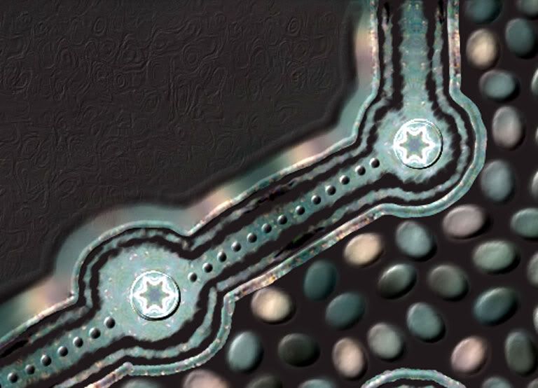
I finished another piece in Painter today, "Barrier"

Detail shot:
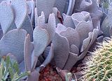
Barrier started with the same cactus photo as yesterday's piece:
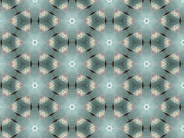
I manipulated a different section of the photo with different parameters in Terrazzo, then I adjusted the levels and colors a bit, and came up with this:
Today, though, I used it as the base for Barrier. I cloned the design, using a dark gray paper color. Then I used tracing paper to allow me to see through the gray enough to draw the wall (with the stars) using a pencil clone brush. Then I turned tracing paper off (the pattern was too distracting!) and finished the design to this point using a variety of cloning brushes:
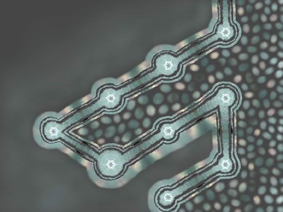
The ground work done, it was time for some fun: embellishing with the impasto plug-in. I used the uniform setting on most of the work, but I did switch to the paper setting to add some dimensional texture to the dark areas on the left side. Hopefully the texture shows up in the detail shot.
I'd like to thank everyone who left comments or sent me words of encouragement, they are much appreciated. I've been working in Painter for many years, but I don't know anyone else who works in it, so it has always been a solitary pursuit. Family and a few friends have seen some of my work, but it is very satisfying to post a few pieces to a wider audience and get a positive response.
¶ 9:21 PM
Detail shot:
Barrier started with the same cactus photo as yesterday's piece:

I manipulated a different section of the photo with different parameters in Terrazzo, then I adjusted the levels and colors a bit, and came up with this:
Today, though, I used it as the base for Barrier. I cloned the design, using a dark gray paper color. Then I used tracing paper to allow me to see through the gray enough to draw the wall (with the stars) using a pencil clone brush. Then I turned tracing paper off (the pattern was too distracting!) and finished the design to this point using a variety of cloning brushes:
The ground work done, it was time for some fun: embellishing with the impasto plug-in. I used the uniform setting on most of the work, but I did switch to the paper setting to add some dimensional texture to the dark areas on the left side. Hopefully the texture shows up in the detail shot.
I'd like to thank everyone who left comments or sent me words of encouragement, they are much appreciated. I've been working in Painter for many years, but I don't know anyone else who works in it, so it has always been a solitary pursuit. Family and a few friends have seen some of my work, but it is very satisfying to post a few pieces to a wider audience and get a positive response.
¶ 9:21 PM
March 20, 2006
Virtual Embellishment
I finished another piece today, a tribute to some of the winners and finalists in the C.C. competition in the Netherlands last November:
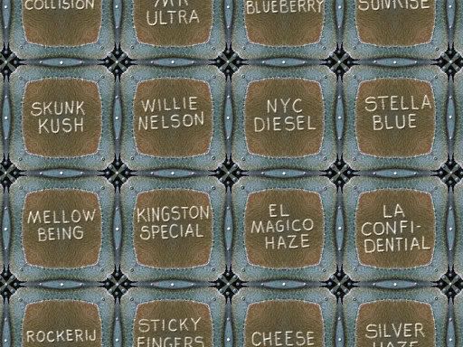
The picture above is a full view of the piece, although of course the piece alludes to being a detail shot.
Here is an actual detail shot:
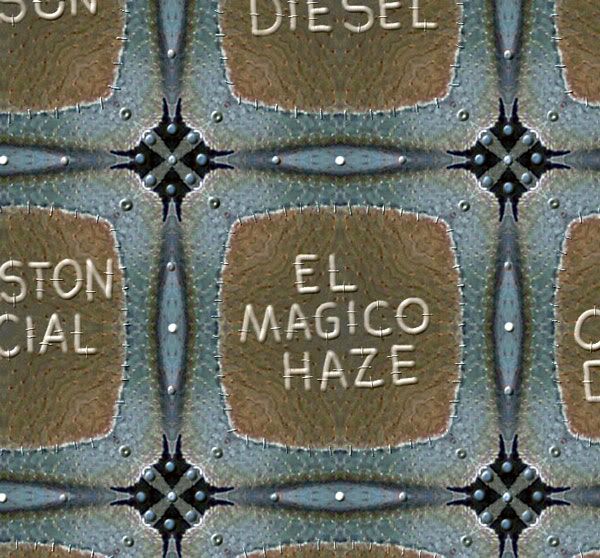
This piece was made in MetaCreations Painter 5. It started as a section of a photograph I took a couple of years ago in Phoenix of some cactus:
I used Xaos Tools Terrazzo to generate the background, which looked like this:
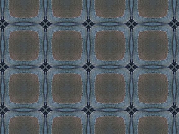
I made some adjustments to get rid of the "hazy blue" look it had, then did the embellishments using the impasto plug-in and the eraser, gritty charcoal, and scratchboard tools. Although I tried to allude to some metallic effects, I did not use the metallic brush plug-in on this piece.
I really enjoyed the time I spent making this piece. My sewing studio is in a state of upheaval at the moment, so I am very limited in my ability to do actual sewing. Hopefully the chaos won't last too long, but in the meantime I have Painter and can at least sew virtually. It is not the same thing, not even close, but my approach to the design challenges in both are very similar, as is the satisfaction I get from doing the work.
And of course, I hope some of my readers will find the piece intriguing enough to be "worth the look."
¶ 4:26 PM
The picture above is a full view of the piece, although of course the piece alludes to being a detail shot.
Here is an actual detail shot:
This piece was made in MetaCreations Painter 5. It started as a section of a photograph I took a couple of years ago in Phoenix of some cactus:
I used Xaos Tools Terrazzo to generate the background, which looked like this:
I made some adjustments to get rid of the "hazy blue" look it had, then did the embellishments using the impasto plug-in and the eraser, gritty charcoal, and scratchboard tools. Although I tried to allude to some metallic effects, I did not use the metallic brush plug-in on this piece.
I really enjoyed the time I spent making this piece. My sewing studio is in a state of upheaval at the moment, so I am very limited in my ability to do actual sewing. Hopefully the chaos won't last too long, but in the meantime I have Painter and can at least sew virtually. It is not the same thing, not even close, but my approach to the design challenges in both are very similar, as is the satisfaction I get from doing the work.
And of course, I hope some of my readers will find the piece intriguing enough to be "worth the look."
¶ 4:26 PM
March 16, 2006
Medallion Quilt
After a lot of frustration trying to photograph this quilt inside, I decided to try a few pictures outside. Much better results, although I still can't get a really clear shot. My camera doesn't do well with shiny surfaces.

The quilt is 20 x 15".
The background and binding are black linen, the backing is a black cotton twill. Front and back were each pieced from 1 shirt.
The batting is a thick piece of fulled wool, made from a sweater with a design I'd hoped would disappear more with the felting:

I did all the quilting and bound the quilt, then attached the felt squares by hand. It was interesting to work out of sequence, although it was a challenge sewing the felt squares in the center sections because the quilt is quite heavy and stiff and not very flexible. But I am quite happy with the way it turned out. The colors, the contrast, the linen/silk/metallic combination, even the sense of wonkiness the piece acquired...It has an "elegant" look about it that I find appealing.
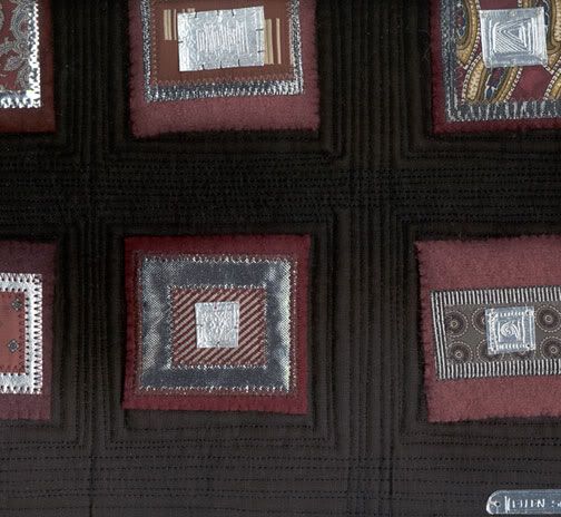
Here is a scan which shows some of the quilting, the background is dark in the picture above, and it is hard to see any of the stitching.
The quilt is 20 x 15".
The background and binding are black linen, the backing is a black cotton twill. Front and back were each pieced from 1 shirt.
The batting is a thick piece of fulled wool, made from a sweater with a design I'd hoped would disappear more with the felting:
I did all the quilting and bound the quilt, then attached the felt squares by hand. It was interesting to work out of sequence, although it was a challenge sewing the felt squares in the center sections because the quilt is quite heavy and stiff and not very flexible. But I am quite happy with the way it turned out. The colors, the contrast, the linen/silk/metallic combination, even the sense of wonkiness the piece acquired...It has an "elegant" look about it that I find appealing.
Here is a scan which shows some of the quilting, the background is dark in the picture above, and it is hard to see any of the stitching.
Embossing Foil
I've finished the silk and silver medallions quilt, I just haven't been able to take a satisfactory photo. I'm working on it, and hopefully will have something to show soon.
In the meantime I have been working on some other foil embossing projects. Here is a piece featuring a multitude of textures on crumpled foil:


I used the impasto plug-in in Painter, set to pick up paper texture, working on a clone so I could pick up the clone source color. The brush I used was an air brush. So much gibberish to most readers, I am sure, but I have gotten some questions about specifics from previous posts on Painter, so I thought I would give some basic details to anyone interested. The embossed frame is also done with the impasto plug-in, set to uniform, using the scratchboard tool and dialing up the variability slider on the color pallet (medium gray selected).
I have also been expanding on the technique I used for the medallions, they make nice pins when put together with a few beads:


¶ 12:32 PM
In the meantime I have been working on some other foil embossing projects. Here is a piece featuring a multitude of textures on crumpled foil:
I used the impasto plug-in in Painter, set to pick up paper texture, working on a clone so I could pick up the clone source color. The brush I used was an air brush. So much gibberish to most readers, I am sure, but I have gotten some questions about specifics from previous posts on Painter, so I thought I would give some basic details to anyone interested. The embossed frame is also done with the impasto plug-in, set to uniform, using the scratchboard tool and dialing up the variability slider on the color pallet (medium gray selected).
I have also been expanding on the technique I used for the medallions, they make nice pins when put together with a few beads:


¶ 12:32 PM
March 11, 2006
Photo Attempts: Boro Bead Jewelry
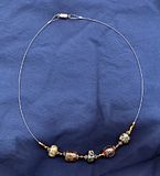
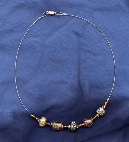
I've been making borosilicate glass beads for a couple of years now, and along with learning the skills involved in actually making the beads, it has become apparent that I needed to figure out how to photograph them. My attempts at taking pictures with my digital camera were a disaster. With or without flash, with or without auxiliary lighting, the glass was just too reflective, and I couldn't even come close to getting a decent picture. I tried my scanner, and although the results were much better, they were still no where near what I had in mind. This is one of my best scans as an example:
My head was swimming with ideas last week, I was trying to sort it all out and decide what kind of a light booth I wanted. On my weekly Friday yard sale trek it suddenly leapt out at me--one of those "I knew it when I saw it!" moments. And "it" was one of those plastic protective collars used on dogs to prevent them from chewing or biting surgical sites. It was marked a quarter, which seemed like an excellent price for a ready-made light box.
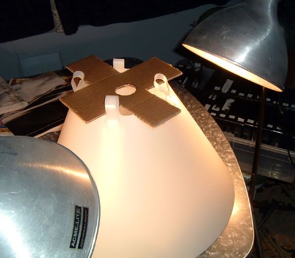
I still had to figure out how to support the camera. Since I wanted to shoot down, the tripod wasn't going to work, as it isn't one of the kind that allow the center pole to be reversed so the camera can hang down over its target. Wanting to keep things as simple as possible, I decided to try cutting a piece of cardboard to fit the collar, with a hole for the camera lens. I was thrilled when I tried it and it worked. Worked quite well, actually. Here is the setup, put together quickly as an experiment:
And here are some of the results of the experimenting I did this afternoon:
Without even clicking on the thumbnails you can probably see the improvement.
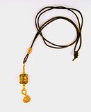

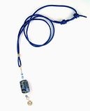
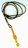
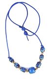
I still have some work to do learning how to fine-tune the set-up, but the photos are significantly better than anything I've previously come up with.
These pictures have all been cropped, and I adjusted the levels in Photoshop, but that is the extent of the computer manipulation on them. I'm not finished figuring this out, the colors are still a little off, and I would like to improve on the way the beads "look" (they look too opaque to me), but I think adjustments to the lighting will take care of some of that. I am also going to check the calibration on my monitor, it has been a long time since I've checked that. I know boro is notoriously difficult to photograph, and I never expected to be successful at it without some study and work. But I'm thrilled with the progress I made today, I definitely feel that I am on the right track and I'm feeling optimistic about the chances of coming up with some decent pictures of the beads and jewelry I have been making.
I just love days like this--productive days when things go right.
I wish just such a day for you--and very soon!
¶ 7:33 PM
My head was swimming with ideas last week, I was trying to sort it all out and decide what kind of a light booth I wanted. On my weekly Friday yard sale trek it suddenly leapt out at me--one of those "I knew it when I saw it!" moments. And "it" was one of those plastic protective collars used on dogs to prevent them from chewing or biting surgical sites. It was marked a quarter, which seemed like an excellent price for a ready-made light box.
I still had to figure out how to support the camera. Since I wanted to shoot down, the tripod wasn't going to work, as it isn't one of the kind that allow the center pole to be reversed so the camera can hang down over its target. Wanting to keep things as simple as possible, I decided to try cutting a piece of cardboard to fit the collar, with a hole for the camera lens. I was thrilled when I tried it and it worked. Worked quite well, actually. Here is the setup, put together quickly as an experiment:
And here are some of the results of the experimenting I did this afternoon:
Without even clicking on the thumbnails you can probably see the improvement.
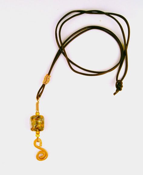
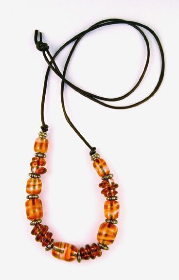
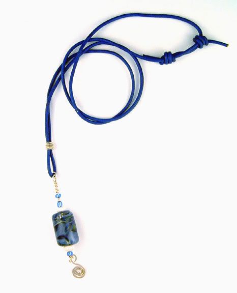

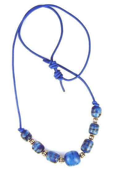
I still have some work to do learning how to fine-tune the set-up, but the photos are significantly better than anything I've previously come up with.
These pictures have all been cropped, and I adjusted the levels in Photoshop, but that is the extent of the computer manipulation on them. I'm not finished figuring this out, the colors are still a little off, and I would like to improve on the way the beads "look" (they look too opaque to me), but I think adjustments to the lighting will take care of some of that. I am also going to check the calibration on my monitor, it has been a long time since I've checked that. I know boro is notoriously difficult to photograph, and I never expected to be successful at it without some study and work. But I'm thrilled with the progress I made today, I definitely feel that I am on the right track and I'm feeling optimistic about the chances of coming up with some decent pictures of the beads and jewelry I have been making.
I just love days like this--productive days when things go right.
I wish just such a day for you--and very soon!
¶ 7:33 PM
Another Fulled-Wool Quilt
I finished another fulled wool quilt today:

It measures 50 x 53". The back is pieced cotton, the batting is a cotton sheet.

Felix (L) and Atticus couldn't resist the lure of the lights and the quilt on the floor for the photo session.
The squares of pink wool are mostly medium to heavy weight. The few lightweight squares I used are carefully positioned so they are not adjacent to any of the ribbed squares, to minimize stretching and distortion.
The pieced pink sections in the inner border are scraps from the squares without any lightweight pieces.
The white/off-white wool I used in the border came from 3 different sweaters, two of which were lightweight ribbed angora blends. Angora blends make soft, very tactile-pleasing felt, but in this particular quilt I learned just how difficult they can be to work with when they are 1) ribbed and 2) used in quantity with heavier weight felts. I wanted the look of the ribs running parallel to the quilt sides, so I carefully pieced that arrangement. Once I started quilting I learned the folly of that idea--the felt wanted to stretch and it was very hard to control. Too late I realized that I should have pieced the white inner borders with squares, alternating the ribs 90 degrees with each one. I think that would have kept things manageable.
The result of all the stretching and distortion are most evident on the cotton side, in the bunching along the quilting lines. When I finished quilting there was some bunching and unevenness in the wool felt, but most of that disappeared with some intensive steaming. (I used a steam generator, the kind with a separate water tank and hose connected to the iron.)
Overall, I am pleased with the quilt. It was made as a gift and the colors were chosen with the recipient in mind. All the materials are recycled fabric, the cottons are mostly from shirts, the border yardage was a piece I bought at a yard sale. The wools are fulled sweaters.
¶ 12:45 PM
It measures 50 x 53". The back is pieced cotton, the batting is a cotton sheet.
Felix (L) and Atticus couldn't resist the lure of the lights and the quilt on the floor for the photo session.
The squares of pink wool are mostly medium to heavy weight. The few lightweight squares I used are carefully positioned so they are not adjacent to any of the ribbed squares, to minimize stretching and distortion.
The pieced pink sections in the inner border are scraps from the squares without any lightweight pieces.
The white/off-white wool I used in the border came from 3 different sweaters, two of which were lightweight ribbed angora blends. Angora blends make soft, very tactile-pleasing felt, but in this particular quilt I learned just how difficult they can be to work with when they are 1) ribbed and 2) used in quantity with heavier weight felts. I wanted the look of the ribs running parallel to the quilt sides, so I carefully pieced that arrangement. Once I started quilting I learned the folly of that idea--the felt wanted to stretch and it was very hard to control. Too late I realized that I should have pieced the white inner borders with squares, alternating the ribs 90 degrees with each one. I think that would have kept things manageable.
The result of all the stretching and distortion are most evident on the cotton side, in the bunching along the quilting lines. When I finished quilting there was some bunching and unevenness in the wool felt, but most of that disappeared with some intensive steaming. (I used a steam generator, the kind with a separate water tank and hose connected to the iron.)
Overall, I am pleased with the quilt. It was made as a gift and the colors were chosen with the recipient in mind. All the materials are recycled fabric, the cottons are mostly from shirts, the border yardage was a piece I bought at a yard sale. The wools are fulled sweaters.
¶ 12:45 PM
March 07, 2006
Fantasy Texture
Has it really been almost 2 months since my last post?
My apologies for the hiatus, some things came up and I just haven't been doing much artwork, and thus have had nothing to blog about lately. I am attempting to get back to my art, I started with "Fantasy Texture:"

I started with a photo I found in morguefile.com:

I used Terrazzo on a section of the photo:

Then I used Painter's metal and impasto brushes to add some 3D texture:

I really like the way this turned out, I am fascinated with the ability to paint with "metals" and "liquids that don't evaporate or soak in" in Painter. It almost feels like soldering rather than painting--and done so effortlessly on a small graphics tablet! I intended for this piece to incorporate the fantastic metal textures with as many metallic elements as I could come up with, and the overall impression I was aiming for was that of a tapestry. A tapestry with a fantasy texture.
¶ 2:14 PM
My apologies for the hiatus, some things came up and I just haven't been doing much artwork, and thus have had nothing to blog about lately. I am attempting to get back to my art, I started with "Fantasy Texture:"
I started with a photo I found in morguefile.com:
I used Terrazzo on a section of the photo:
Then I used Painter's metal and impasto brushes to add some 3D texture:
I really like the way this turned out, I am fascinated with the ability to paint with "metals" and "liquids that don't evaporate or soak in" in Painter. It almost feels like soldering rather than painting--and done so effortlessly on a small graphics tablet! I intended for this piece to incorporate the fantastic metal textures with as many metallic elements as I could come up with, and the overall impression I was aiming for was that of a tapestry. A tapestry with a fantasy texture.
¶ 2:14 PM